Too much art to post. i don't know where to begin. i'll just choose a few pieces. for your info, i have now two tumblr accounts if you want more art. Design cuts is all about my sketches. and of course my regular Sparth tumblr is dedicated to concept art as well as photo works. I will of course still update Sparth Construct right here too. First piece is a personal work based on my template techniques, using snippets and extracts out of previous personal artworks. loads of fun. i've also added two weapons from IDsoftware's Rage, released last year. enjoy.
Latest Entries
- Jan 11, 2012
- In
- 91 Comments
New Year Update
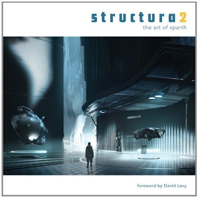
I haven't updated the Construct for ages, so time to give a bit of an update to start the new year. The most important part of my update is dedicated to Structura 2, my second book will hit the shelves at the end of January of this new year. i have been putting a lot of dedication and time to this second opus during 2011, and we finally managed to get it done. a huge thank you for Scott Robertson, Tinti Dey, Jenny Sue, and DesignStudioPress for their dedication and patience. big Thanks to all who have participated to the project, with awesome words from my friends David Levy, Kenneth Scott and Stephan Martiniere. releasing a book is always an adventure. when the road is smooth, and bumps minimal, it's always a plus. Structura2 will soon be available via DesignStudioPress or Amazon.
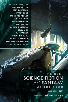
I was going through io9 the other day, and stumbled on an article about a book cover that was released with a piece of art i did. the cover looks great. here's a link to the article: Book cover art that'll make you wish you lived on a space station. The book is a selection of short stories compiled by Jonathan Strahan.
On a side note, i am now on Tumblr, and you can follow me here: http://sparth.tumblr.com/
and for the photography side, i also finally joined 500px with a selection of my best shots from these last two years.
IDsoftware's Rage was released back in october last year, and we have seen some pieces of concept art pop from from the game. On my side, i still have dozens of pieces i haven't showed yet. i will probably post some more on my Tumblr account, but do know that there are already a few pieces published on my CGhub gallery.
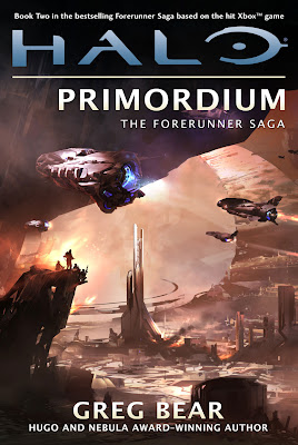
Greg Bear's Primordium is finally out. i was honored to do the cover for the series. Primordium is the second book, after Cryptum last year. That's about it for now. i will have truckloads of things to actually post, and i guess they'll resurface in my mind pretty soon. will have more updates then. Happy new year to all!

I was going through io9 the other day, and stumbled on an article about a book cover that was released with a piece of art i did. the cover looks great. here's a link to the article: Book cover art that'll make you wish you lived on a space station. The book is a selection of short stories compiled by Jonathan Strahan.

On a side note, i am now on Tumblr, and you can follow me here: http://sparth.tumblr.com/
and for the photography side, i also finally joined 500px with a selection of my best shots from these last two years.
IDsoftware's Rage was released back in october last year, and we have seen some pieces of concept art pop from from the game. On my side, i still have dozens of pieces i haven't showed yet. i will probably post some more on my Tumblr account, but do know that there are already a few pieces published on my CGhub gallery.

Greg Bear's Primordium is finally out. i was honored to do the cover for the series. Primordium is the second book, after Cryptum last year. That's about it for now. i will have truckloads of things to actually post, and i guess they'll resurface in my mind pretty soon. will have more updates then. Happy new year to all!
- Jun 21, 2011
- In
- 193 Comments
Pas de tir


more productions from this year. "Pas de tir" is a fast iteration based on an existing photo that i deconstructed to the point of no return. The first cover was used for the "best science fiction and fantasy of the year volume 5, a compilation done by Jonathan Strahan.
- Jun 18, 2011
- In
- 26 Comments
medieval interlude sketch


First of all, Halo4 has been announced by Microsoft and 343Industries.
i'm proud being part of the adventure.
- Apr 17, 2011
- In
- 20 Comments
Survol

i didn't use any ref for this one. the only thing i was having was this photo of a piece of glass i had found online, probably coming from an industrial constructor showing a sample of their glass stuff for marketing reasons. i found the tones fascinating and got inspired. i guess the whole thing made sense at a particular moment. :)
on the technical side, i have been painting a lot with the smudge tool lately, thanks to mister Thom Scholes himself. The smudge tool can allow a great control of your shapes via displacement of entire pannels and areas of your canvas. it's fascinating.
- Mar 17, 2011
- In
- 22 Comments
Images for Japan (des images pour le Japon)

My friends from the french art site Cafesale.net have started a project in order to help Japan and the dramatic situation going on right now in the North East. the project can be found here: Tsunami - Des Images pour le Japon it's all in french, but the images don't need words do they?
Here is my modest contribution for their fantastic and courageous initiative.
- Feb 7, 2011
- In
- 23 Comments
Images - First selection for 2011


I should probably not even wish a happy new year to all since we're in february, but anyway. here's a (late) first post for this new year. I've been preparing and gathering quite a lot of new images for a second book that will happen sometimes this year. there's still a lot to do but it's already coming along fine. I will probably have a section dedicated to specific methods i have been using these last years and i hope it'll be a nice helper for some, or at least a visual stimulation that will give more food to any creative process. More soon.
On the custom shapes front, i have been experimenting here and there. The medieval interlude posted above, as i call them, has been done using this technique a lot. it totally gives a fast and effective result. Very exciting. However, the images done this way need to be counter balanced with smoother brush work and visual junctions in order to cut some of the obligatory harsh edges given by custom shapes. One way to do this is to use the smudge tool in order to erases some of these edges. the blue space piece was done the same way, but i skipped the last smoothing steps a bit, and it shows. The more textured piece is just a basic sketch that transformed itself into a more achieved image. More weirdness soon.
- Nov 13, 2010
- In
- 30 Comments
The custom shapes tool

It's been a month since i started experimenting with a new technique based on custom shapes. i had given it a try last year but i just couldn't figure out how it was going to be THAT useful to a work process already based on custom brushes. it turns out that custom shapes are, in a way, far more versatile than brushes when it comes to organizing your canvas. the "abstract" factor is partly taken out of the workflow. not entirely though, as you can still mess around with insane shapes. but the way you apply shapes is just more connected to the environment you're creating, allowing super fast compositions in no time at all. i'll continue pushing this technique as it is, for now, extremely promising.
here's an environment extract i'm working on, done mainly with custom shapes. also, go visit kekai's blog for his latest, it's based on custom shapes and it's one thousand times worth it.
- Oct 22, 2010
- In
- 14 Comments
halo cryptum
343Industries and Microsoft have announced the first volume of the Forerunner trilogy written my Greg Bear. here is the cover for the novel.

i also have been continuing my ipad explorations and will post another batch of concepts very soon. The Artstudio app has been updated not long ago, and i got to admit it is becoming my favorite of the bunch now. line tool is awesome, and they finally implemented a clone stamp tool which is easily configurable and a pleasure to use. Now i hope they will add a selection tool soon, as it's the only feature i wish to see on the ipad one day.
more soon!
- Sep 29, 2010
- In
- 22 Comments
Give me a clone stamp tool on the ipad!
After two weeks of doodling around on the ipad, i got to admit it's an awesome digital tool, and this despite the lack of pen pressure which is dramatically missing from what could have been the perfect digital sketchbook.
Now it's not all marvelous though, and this for one reason: you have 5 main drawing apps on the ipad, and each one of them is having features that the other don't have.
finger tool? ARTSTUDIO, and LAYERS.
clone stamp tool? only in PHOTOFORGE.
add an overlay layer? BRUSHES.
save your custom brushes and parameters? ARTSTUDIO.
"multiply" blending mode? SKETCHBOOK PRO, BRUSHES.
anyway you see the point. it's pretty infuriating!
i have high hopes that there will be additional features soon that will allow us to chose an app for good instead of permanently sending sketches to the photo album in order to switch from one app to the next. just in case it may happen one day, there's one feature i would LOVE to see implemented, in a better way, and whatever the app: Only PHOTOFORGE is having it for now, and in a very basic way: the CLONE STAMP TOOL. seriously, maybe it's probably only considered as a photo thing by many, useless for anything related to conceptart. well you're dead wrong! Clone stamping is vital to my own workflow as it allows me to reproduce entire areas, and it totally belongs to a concept art process.
we're at the very beginning of the Ipad, and i'm already excited about what's on there. can't wait to see more !
here's three sketches done in ... multiple apps!

Subscribe to:
Posts (Atom)
About Sparth
credits:
Halo Franchise (343 Industries - Microsoft)
Halo 4 (343 Industries - Microsoft)
Rage (IDsoftware)
Assassin's Creed (Ubisoft)
Prince of Persia - Warrior Within (Ubisoft)
Cold Fear (Darkworks studio)
Alone in the Dark 4 (Darkworks)
Structura (Artbook) 2008
Structura2 (Artbook) 2012
Concept Art (Artbook) Ballistic 2006
Structura
Published by DesignStudioPress and Released in 2008, Structura - the art of Sparth, is available at Amazon as well as DesignStudioPress. Structura is a collection of Sparth's personal artworks in addition to a selection of his professional works.
Sparth links
Art blogs
- A. Riabovitchev
- albert ng
- alberto mielgo
- Alex Jaeger
- Alexander Ovchinnikov
- andrew kim
- annis naeem
- anthony francisco
- armand serrano
- Barontieri
- ben mauro
- bengal
- billy george
- christophe lautrette
- daarken
- daniel C
- diglett
- drawthrough
- Farvus
- feerik
- gary
- goro fujita
- hans bacher
- hydropix
- jason felix
- jean sebastien rossbach
- john park
- Josh Kao
- justin oaksford
- kekai
- limbolo
- luc ADR - moket
- luc desmarchelier
- maciej kuciara
- manu malin
- mathieu lauffray
- matt rhodes
- nicolas ferrand
- pao
- patrick pion
- paul lasaine
- peter maynez
- peter popken
- pierre-etienne travers
- project sand
- Rainart
- Rodney Fuentebella
- romain jouandeau
- sam brown
- seth engstrom
- thom tenery
- thomas scholes
- timothy rodriguez
- toby lewin
- vyle
- watmough
- wesley burt
- whit brachna
art sites
- blackfrog
- bruce pennington
- chris foss
- christian lorenz scheurer
- daniel dociu
- Edouard Caplain
- elliot
- francois baranger
- frederic st-arnaud
- herve groussin
- horia dociu
- jaime jones
- james clyne
- jan ditlev
- jesse van dijk
- john wallin liberto
- khang le
- mark goerner
- Maxime Desmettre
- prometheus spawning grounds
- rick o' brian
- sim-r
- stephan martiniere
- stephane tartelin
- tim mcburnie
- xuhui
resources
Followers
Sparth Construct
Total Pageviews
Powered by Blogger.
Copyright 2010. All rights reserved.
RSS Feed. This blog is proudly powered by Blogger and uses Modern Clix, a theme by Rodrigo Galindez. Modern Clix blogger template by Introblogger.


